After recently reaching the Number 1 spot click to read more on the Asian and Haiku poetry paid list at Amazon.ca, (woohoo!) 😉I have now decided to create another book/eBook in the Haiku Reflections series.
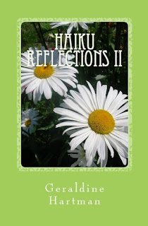
The print cover above (click to enlarge cover) is what I have worked out so far.
I wanted something with a wintery theme and also, a cover that would be in keeping with the previous two books/eBooks in this series:
What do you think?
I was going for an icy, cool, wintery look with the new one, so that it would be a good contrast from the two previous volumes.
I tried several colors for the background and also the text color and overall, this seemed to work best.
I am open to suggestions though and have not submitted the cover for publication yet.
I DID try black for the text color and also pure white, but neither of them seemed quite right. The text above is a lighter blue, in keeping with the cover color.
I look forward to your suggestions and feedback!
The only thing that I DON'T want to change is the cover photo. I like this one from my files, a lot.
But I am open to ideas re: the color of the background and also the text.
It is a template I am working with, so I can only adjust it so much, if I want to stay with this theme.
Thank you in advance for your input! It is appreciated.
When I created the other volumes in this series, I had lots of feedback from readers beforehand and it was really helpful. 😊


I like the way this cover looks already. The background color and photo are beautiful. And I agree, the black and also the white text you tried previously, didn't really work.
ReplyDeleteThanks Joe!😂 It's great to be working on a book again. And you know how much I love haiku.🌷
ReplyDeleteI like the cover. Very good design.
ReplyDeleteGreetings from London.
Thank you for your kind words.😂
DeleteYou are a girl with an eye for design. I'm impressed with your talent.
ReplyDeleteThank you for the lovely compliment.😊
DeleteLove the cover you already have. Well done you are doing well with your books I am impressed. Have a good week Diane
ReplyDeleteThanks so much Diane and welcome to MRLR.😊
DeleteThanks for returning the compliment, appreciated. Cheers Diane
Deletethanks for stopping by again!
DeleteIt is perfect, Geraldine, colour, design, everything. If the book is designed as a winter theme I don't think you could better it.
ReplyDeleteThanks Val.😂
DeleteI already had the autumn and summer covers, so went with a winter theme this time. I had actually planned to use a snow pic but they didn't show as well as this one.🌞
I too like the cover you have chosen. Looks perfect!
ReplyDeleteThanks Cat Lover!😂
DeleteMr. Cheddar and I both love your blog name. Paws Up!!😽😽
I think it flows well! I like the colors and I think the image is perfect. I also like that the layout of all three books is the same, it is a nice way to tie them together!
ReplyDeleteThanks for the feedback Debbie.😆 Hope you enjoyed the cherry blossom festival. That sounded lovely.🌼🌼
DeleteI like that cover, too. Glad you are writing haiku again!
ReplyDeleteI am enjoying creating this new book SO much Sandy. I haven't written any haiku in a long time, it's such a relaxing creative process, as you know. I'm glad you like the cover.
DeleteI like the new cover and it complements the other covers very well
ReplyDeleteThanks Juliet.
DeleteI think I'll complete the series with one more book after this, that one will have a spring theme. Tulips perhaps? :-)
The Fall leaves are beautiful and they really show up well with the dark red background. I think you've found what you're looking for. Hugs, Diane
ReplyDeleteThat red book is actually the first one in the series Diane, it is only the aqua one that I am working on right now. I'm glad you like that cover though!!!
Deletethe bluegreen looks good but I think it's too strong for the photo, maybe a lighter hue?
ReplyDeletethe title doesn't read well, perhaps moving it toward the bottom of the photo? I know you probably want it to match and stay at the top like the others but a change wouldn't be bad. when I first saw this cover, I thought it's it's your other book only with different colors. I guess it's habit but I find new things, even if it's a series, there should be a little more difference so people won't think it's the same book.
I would definitely make your name into a different font type as I always think book titles and author names should never be the same but that's just me.
as for the back, perhaps mores spacing between the boxes and the text
there's my 2cent.
have a lovely day.
Thanks for your very detailed feedback Lissa.
ReplyDeleteI'm not really happy with how the title looks but I do like this photo a lot. Perhaps I will try some other background colors before making my final decision, and this would change choices for the text color too.
I am using a template so there is only a limited amount I can adjust .
I do think series books should look similar though, so that it's obvious they are part of that particular series of books.
I know you do a lot of design work so your opinion is appreciated.😂